Dear friends and fellow bloggers-
I would like your opinion.
Which of the two fireplace surrounds and mantels
would you choose
if...
Your living room looked like this?
and your fireplace looked like this?
I guess that I should show you some other details
in my living room-to give you the whole idea..
Three bird prints that hang in the entryway
(please don't notice how crooked they are ;-)
I have used a lot of the golds and yellows
and the blues and the greens.
I would like to incorporate some of the gray tones.
Above is a close up (for color purposes)
This is the wallpaper that hangs in the dining room
which is open and very visible from the living room.
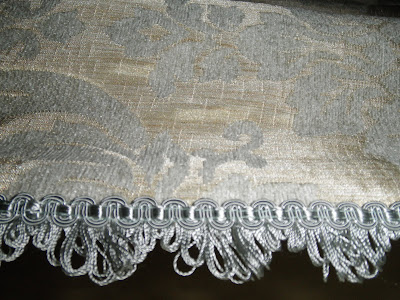
The fabric and trim on the draperies.
The drapery panel fabric against the window seat fabric
(I love the "bee" fabric)
You can also see the wall color here.
Other items in the room include the pillows above...
This vignette...
Black Hutch with fabric back...
Above is the fabric that I used for the back of the black hutch.
More elements like this terrarium which sits on
the shelves next to the fireplace.
Close up of some other items on bookshelves...
and other details.
I love the warmth of the first fireplace surround
and the
combination of the stone mantel
with the metal screen.
and
I love the gray element in the second fireplace surround
along with the detail in the mantel.
Now that I see them together..
they really look very similar
hmmmmm...
Tell me please...
what do you think?
Wishing you warmth and elegant details
wherever you are.
Cristine


No comments:
Post a Comment
I adore comments. Please tell me your thoughts.